App Layout & Data Grids
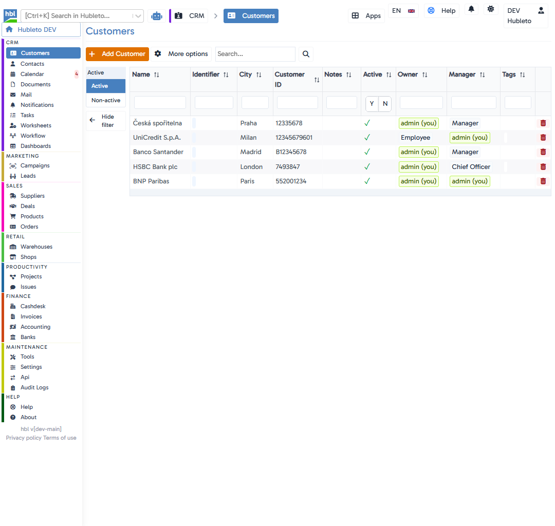
When you open most applications in Hubleto (such as Campaigns, Customers, or Products), you will encounter a standard interface. This consistency ensures that once you learn how to navigate one app, you instantly know how to manage data everywhere else.
This guide explores the layout, powerful search capabilities, and the hidden features designed to speed up your workflow.
Top Action Bar
At the top of the interface, you'll find the primary tools for managing the app's records.
The "Add" Button
A prominent orange button (e.g., + Add Campaign or + Add Customer) is always available on the top left to create a new record.
More Options Menu (⋮)
Right next to the "Add" button is a context menu icon (⋮). Clicking this reveals powerful data manipulation tools:
- Show/Hide filter: Toggles the left sidebar filters to give you more horizontal workspace.
- Show as plain table: Switches the rich interactive grid into a basic HTML table, which is very useful for cleanly copying and pasting data into Excel or emails.
- Enable edit mode: Activates inline editing! When enabled, you can click directly into table cells to edit data on the fly without opening the full record form.
- Export to CSV: Downloads your current view (including any active filters) into a CSV file.
- Import from CSV: Opens a wizard to upload data into the application.
- Customize Columns (Columns): Allows you to select exactly which data columns are visible and adjust their order to suit your preference.
Main Search Bar
Located in the top action area, this search input performs a broad, full-text search across all visible columns in your current view. Simply type your keyword and press Enter.
Table Features
The core data grid provides precise control over how you view and find your information.
Sorting
Next to the title in every column header, you will see sort arrows (↑↓). Clicking these arrows sorts your entire dataset alphabetically or numerically by that specific column.
Column-Specific Search
Beneath the column headers, there are dedicated input fields. These are used for highly precise filtering. For example, if you are looking for a customer in London, you can type "London" directly into the search field below the City column header. This guarantees you won't accidentally find a customer whose Name contains "London".
Inline Actions & Indicators
You will often see visual indicators and actionable buttons within the table rows:
- Delete Button: On the far right of every record row, you will find a prominent red trash can icon. Clicking this allows you to quickly delete that specific record.
- Green checkmarks (
✓) or red crosses (X) for quick boolean values. - Badges like
admin (you)to quickly identify records you own or manage.
Sidebar Filters
On the left side of the screen is the Sidebar Filter panel.
- It provides rapid, categorized filtering (e.g., filtering by
Ownership: Owned by me, orStatus: Open). - Clicking these filters updates the table instantly.
- You can collapse this panel at any time by clicking the
<- Hide filterbutton at the bottom of the sidebar to maximize your screen real estate.