Record Form Layout
Whenever you click to open a record in Hubleto (e.g., a Customer, a Campaign, or a Task), you are presented with a powerful Record Form. This layout is designed to keep all related information visible and accessible while providing quick tools to manage the data.
This guide explains the layout and the hidden features you can find inside a record form.
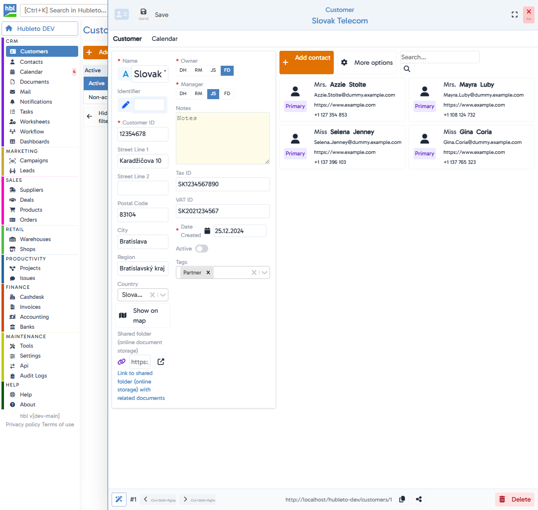
Top Action Bar
At the very top of every form, you'll find the main action bar:
- Save: On the left, you'll see a prominent button to Save your changes (shortcut:
Ctrl+S). If you have unsaved changes, this button will turn orange to indicate action is needed. - Title: The center displays the entity type (e.g., "Customer") and the name of the specific record (e.g., "Banque Marocaine").
- Window Controls: On the right, there are buttons to expand the form to Fullscreen (
⛶) and to Close the form (XorEsc).
Tabs & Related Data
Directly below the top bar, you will often find Tabs.
Hubleto forms do not just show data for the main record; they show everything related to it.
For example, in a Campaign form, you might see tabs for Documents, Contacts, Tasks, or Leads. Clicking a tab switches the view to show these connected records, allowing you to manage the entire ecosystem of that record without leaving the form.
Workflow Pipeline
For records that follow a specific process (like Deals, Tasks, or Campaigns), a Workflow Bar appears just below the tabs.
- It visually indicates the current phase of the record (e.g.,
In progress,Ready to test,Deployed). - You can click
Change workflowto manually advance the state. - On the far right of this bar is a Closed toggle to explicitly mark the record's life cycle as finished.
- You can also see "Last update" timestamps and who performed the change.
Form Body & Input Fields
The main area contains the data fields, which are smartly organized into multiple columns to maximize screen space.
- Smart Lookups: Fields like
CustomerorContactare often lookups. They let you search and link existing records instantly. - Owner & Manager Selectors: You'll often see badges showing who owns or manages the record (e.g.,
DH,RM). A greenadmin (you)badge makes it clear when you are assigned. - Custom Components: Some forms include rich components right in the layout, like a standalone
Todochecklist or interactiveTags. - Map Links: Location fields (like Country) might show a
Show on mapbutton. - Shared Folder: An integrated link to the record's cloud storage directory (Google Drive, OneDrive) can be found here for quick file access.
Footer Toolbar
The footer of the form is packed with essential navigation and utility tools:
- AI Magic Wand: Clicking the magic wand icon opens Hubi (the AI Assistant) in a new tab, automatically passing all the record's context to the AI so you can ask specific questions about it.
- Record ID & Navigation: Displays the unique ID of the record (e.g.,
#2). Next to it are Prev (<) and Next (>) buttons (shortcuts:Ctrl+Shift+PgUpandCtrl+Shift+PgDn) to swiftly move through the list of records without closing the form. - Unsaved Changes: A yellow warning badge appears if you have made modifications that aren't saved yet.
- Record Link & Share: The direct URL to the record is displayed here. You can click the Copy icon next to it to quickly share the link with a colleague. Next to it, you may also find a Share button to manage who has access to the record.
- Delete: On the far right, you'll find a button with a trash icon to permanently Delete the record.